Guest Blog by Murad Bushnaq
In all of your years working as a nonprofit professional, you’ve probably seen countless trends and best practices go in and out of style.
When it comes to essential activities such as fundraising, marketing, and donor stewardship, the guiding wisdom seems to evolve constantly, keeping your team on its toes.
The same goes for nonprofit website best practices.
Perhaps you designed your website several years ago when digital fundraising really took off, and it’s served your organization well in the time since.
But what was considered effective design ten, five, or even two years ago doesn’t align completely with current standards, and you might have noticed your engagement metrics dropping.
All this to say, if it’s been a few years since you’ve conducted a refresh, it might be time to revamp your nonprofit’s website. Here are five signs that your site might be ready for a makeover:
- Your website isn’t driving donations effectively.
- Your site’s engagement metrics are declining.
- Your branding is outdated.
- Your website isn’t optimized for mobile devices.
- Your site doesn’t connect with visitors on a deeper level.
Above all, to design an effective website, you need access to a powerful website builder. Whether you’re using a generic website builder like WordPress or Wix, or a nonprofit-specific one, ensure your website builder offers the design and engagement features you need to drive traffic.
If you think it’s time to switch to a new platform, review Morweb’s guide to the best nonprofit website builders to explore your options. Otherwise, let’s dive in!
1. Your website isn’t driving donations effectively.
Let’s say that a few years ago, you created an online donation page within your website to help facilitate giving using your website. Your page also collects donor data, and over the past few months, you’ve noticed supporters are filling out the form less and less. You feel yourself start to move toward panic mode, thinking, If our website isn’t driving donations effectively, we’ll earn less for our mission, meaning we won’t be able to help as many people, meaning… disaster!
We’ll stop you right there! All your website probably needs is a revamp to your online donation process. The good news is that your online fundraising strategy doesn’t have to be set in stone— you can make small changes here and there that add up to make a major difference.
The Solution
Take a look at your online donation form to assess areas for improvement. To determine which changes you should make, review the top donation page best practices:
- Brand your giving form to match the rest of your website. Consistent branding builds trust and reassures donors that their gifts are going to the right place. Make sure your donation form’s branding aligns with other pages on your site.
- Offer multiple giving options on your form. Supporters may not even consider increasing their donations without a suggestion! Use your giving form to promote recurring donations and offer supporters suggested giving amounts to help guide their decisions.
- Use a minimalist page design and structure. You want to keep your donors’ minds set on giving as they move through your donation page, so work to eliminate distractions. This means you should make sure all form fields fit on a single page and that you only ask necessary questions.
Your donation page should move supporters through the giving process quickly and offer them a professional, positive experience so they’re more inclined to donate again. Enhancing your donation form is an essential first step to optimizing your crucial online giving process.
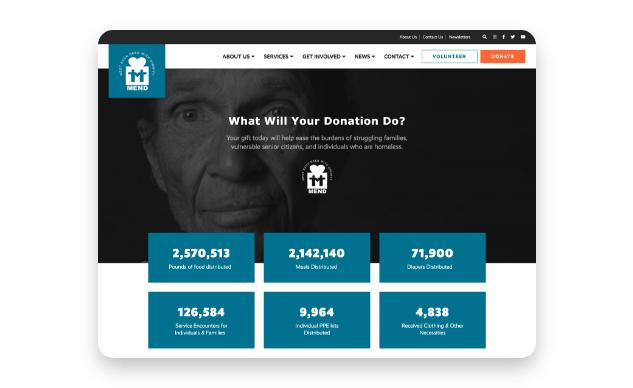
2. Your site’s engagement metrics are declining.
Certain pages on your nonprofit’s website are naturally more important than others. These include your homepage, which offers a critical first impression, as well as engaging forms such as your online giving form and volunteer registration page.
Perhaps you’ve started seeing less engagement on these pages. This is reflected in your website analytics— your bounce rate is high and your average page session is low. All of the signs are telling you that your visitors just aren’t as interested in your website as they once were.
The Solution
Simple adjustments to how you approach your website’s user experience can boost your engagement numbers. User experience is the way your organization’s supporters interact with your website, from the time they enter the site to when they click away. It encompasses each action they take, from reading blog posts to signing up for volunteer opportunities to using your online donation form.
Improve your site’s user experience by:
- Simplifying your navigation menu. Keep your menu to just around five items to help keep things simple for visitors navigating through your site.
- Including compelling calls to action. A call to action is a short phrase that encourages visitors to do something, whether it’s donating, registering to volunteer, or signing up for your email newsletter. Incorporate calls to action throughout your website to give visitors a path to engage with you further.
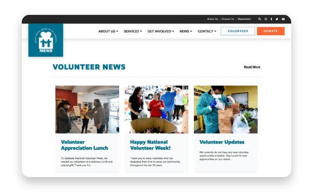
- Making the most of multimedia elements. Interesting visual elements like photos, videos, and graphics tend to be more engaging than long paragraphs full of text. Enhance your website pages with photos that evoke emotion or brief videos that highlight your organization’s mission.

By using streamlined design and engaging visual elements, you can keep your website’s focus on what matters most: your mission.
3. Your branding is outdated.
Let’s say your organization was founded in 1993, and your branding reflects that founding date a little too well. If your website looks like its favorite TV show growing up was “Saved by the Bell” and it once owned a Walkman, it’s probably time to think about how you can refresh your brand elements.
By the same token, your organization’s mission might have changed slightly over the years, and your branding doesn’t reflect your new mission. For instance, you might have started out as an organization that provides free tutoring to kids, but you’ve grown your programs over the years and now offer a full-fledged scholarship fund to help students pay for college. You may be interested in adjusting your brand elements to account for your new objectives.
The Solution
Take this opportunity to conduct a full brand refresh or implement your new branding details into your website. Think about how you can modernize each element of your brand, including your:
- Color palette: Can you arrange your core colors in a more visually appealing way, or choose new color combinations that more accurately reflect your brand? For instance, let’s say that you’re an environmental nonprofit that’s traditionally used green shades, but your focus has recently turned toward ocean-related sustainability issues. You may take this opportunity to adjust your color palette to incorporate shades of blue.
- Logo: Does your logo have a modern look and feel, and does it accurately convey your organization’s mission and purpose? You can try out different logo styles, such as using just words or words and a small image or icon, to determine which feels most appropriate for your brand.
- Fonts: As new fonts are developed, old fonts tend to go out of style. If your website’s fonts are looking a little outdated (Comic Sans is a popular culprit), test out a few new options to freshen up your site’s look. Standard sans serif fonts are always a safe bet and look clean and professional in digital formats.
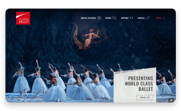
Your website is a highly visible expression of your nonprofit’s brand. If your site looks outdated or inauthentic to your organization, a quick brand refresh can give your brand new life and excite supporters.
4. Your website isn’t optimized for mobile devices.
According to Double the Donation’s nonprofit fundraising statistics, the number of donations completed through mobile devices increased by 50% over the last year. Nonprofit supporters are increasingly engaging with their favorite organizations using their smartphones.
This means if your organization’s website isn’t mobile friendly, you’re missing out on a potentially major amount of support.
The Solution
Ensure your website is mobile-responsive and optimized for smaller screens. Strategies for optimizing your site for mobile include:
- Use a website builder that allows you to view your website in the mobile format. Your website builder should allow you to assess what your website looks like on different screen sizes. Then, you can pinpoint any formatting issues and adjust them accordingly.
- Choose a mobile-responsive theme. If you’re going for a full website update, choose a theme that automatically adjusts to fit mobile screens. This will ensure that no matter how you design your site in the desktop format, it will appear cohesive and streamlined in the mobile view as well.
- Increase graphic and text sizes. Since mobile screens are much smaller than desktop or laptop screens, you want to ensure that your graphics and any images with text on them are large enough to be viewed in the mobile format. Otherwise, visitors will have to pinch at their screen to zoom in, and some may struggle to read your content.
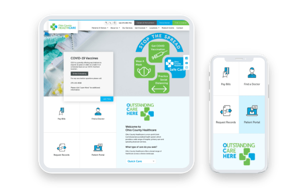
The way your website looks on mobile screens is just as important, if not more so than how it looks on laptop and desktop computers. Mobile engagement will only grow in importance, so ensure your website is ready to meet your audience members’ preferences.
5. Your site doesn’t connect with visitors on a deeper level.
The best, most engaging nonprofit websites don’t just feature streamlined design, visually appealing aesthetics, and mobile-friendly content. They engage supporters on a deeper, personal level, sparking an emotional connection that leads to long-term support.
Perhaps you feel your website is falling short of this goal and lacking in the elements that help build a true online community. Maybe your calls to action are too generic or you have one too many stock photos on your site pages. Or, perhaps you’re seeing more engagement with traditional fundraising channels like direct mail and events and less than you expected with your digital outreach materials.
The Solution
You can implement a few quick changes to tell your nonprofit’s story in a more effective way using your website. Incorporate the following nonprofit storytelling best practices into your design:
- Use compelling images and videos. Choose imagery that showcases your mission in action, whether it’s volunteers working on building a new house for a community member, or a family adopting their new pet. Remember to use real pictures, not stock images. Most of your audience members are probably digitally savvy enough to spot the difference, and stock photos come off as disingenuous.
- Incorporate real stories and statistics. Be sure to use real stories that feature the voices of your nonprofit’s staff, volunteers, and constituents. Supplement these stories with statistics that illustrate different aspects of your work. For instance, you might mention how many community members you’ve served or how much funding you’ve raised for important research.
- Make a connection between community support and your nonprofit’s work. Make sure your website explains how you’re able to continue working toward your mission with the support of generous supporters, such as your donors and volunteers. Explain how volunteer support has a direct impact on your programs, or how donations enable you to continue serving your community.
Your website should be a resource that everyone, from your long-time supporters to your new audience members, can use to learn more about your organization and stay in touch. Make sure it accurately conveys your story so that anyone who comes across it knows what you’re all about.
The Gist
If you can see any of these signs on your own website, sit down with your team to start brainstorming how you can revamp it. Once your site is refreshed and optimized for driving user engagement, you can promote it using your other digital marketing channels, such as your social media pages and email newsletters.
To ensure your website stays relevant and effective, adopt a continuous improvement approach. Check in on your site regularly and make small changes here and there to avoid having to undergo large reworks.
About the author: Murad Bushnaq is the Founder and CEO of Morweb. Since its inception in 2014, Murad has acted as Creative Director and Chief Technologist to help nonprofits spread their vision online through engaging design, intuitive software and strategic communication.
How to Build Your Nonprofit Email List Using Your Website & Social Media

Your email list is essentially the communicative lifeblood of your nonprofit.
Okay, that was a little dramatic, but seriously, your nonprofit needs a robust and plentiful email list to continue engaging your community and garnering support.
But how does your nonprofit go about building this active email list, you might ask?
Via your nonprofit’s website and social media profiles of course!
J Campbell Social Marketing has partnered with Elevation to bring you this free guide to building your nonprofit email list, using the tools that you already have!